Need a clean Nintendo logo PNG for your stream overlay, YouTube thumbnail, or gaming project? You’re not alone. Nintendo’s iconic red branding is one of the most recognizable logos in gaming history, and content creators across Twitch, YouTube, and social media constantly search for high-quality versions. But here’s the thing: not all PNG files are created equal, and using the wrong format or resolution can tank your project’s quality.
This guide breaks down everything you need to know about finding, downloading, and using Nintendo logo PNG files in 2026. We’ll cover where to grab official assets, which variations exist, how to navigate copyright rules without getting hit with a takedown, and the best practices for keeping that crisp, transparent background intact when you’re resizing or editing. Whether you’re setting up your first Twitch panel or designing a Nintendo-themed thumbnail, you’ll walk away with the exact knowledge to do it right.
Key Takeaways
- A Nintendo logo PNG with transparent background is essential for streaming overlays and YouTube thumbnails, as it eliminates white boxes and layers cleanly over any background.
- High-resolution Nintendo logo PNG files (at least 2000px+ for 1080p content) must be sourced from official brand resources or trusted repositories like Wikimedia Commons or Brands of the World to ensure quality.
- Using Nintendo logos falls under fair use for gameplay videos, reviews, and commentary, but avoid merchandise sales or implies official affiliation to stay compliant with trademark law.
- Always scale PNG logos downward from the highest resolution source using bicubic interpolation to prevent pixelation and maintain the crisp, professional appearance Nintendo’s iconic branding deserves.
- Nintendo Switch logo variations and console-specific designs serve different creative purposes—choose the red wordmark for general content or console-specific versions to match your project’s theme.
Understanding the Nintendo Logo and Its Evolution
The History Behind Nintendo’s Iconic Branding
Nintendo’s logo has gone through several iterations since the company’s founding in 1889, but the modern red Nintendo wordmark we recognize today solidified in the 1980s. The bold, rounded sans-serif typeface became synonymous with the NES era and has remained largely unchanged for over four decades.
The logo’s staying power comes from its simplicity. No complex emblems, no gradients, just clean, confident lettering that works at any size. From the tiny corner of a Game Boy screen to massive E3 banners, that red block stays readable. Compare that to some competitors who’ve cycled through multiple redesigns, and you see why Nintendo stuck with a winner.
Different eras brought subtle variations. The 90s saw bolder outlines during the N64 and GameCube days. The Wii era introduced a lighter, more approachable aesthetic with gray tones. The Switch generation brought back the classic red but with refined spacing and sharper edges optimized for digital displays. Each console generation also brought its own logo treatment, think the Switch’s red and blue accent or the 3DS’s silver-blue gradient.
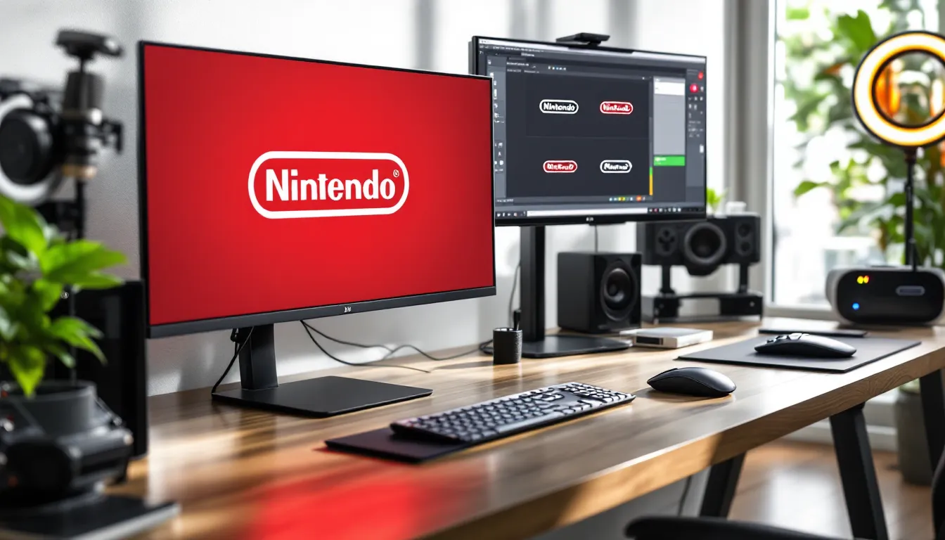
Why PNG Format Is Essential for Gaming Graphics
PNG (Portable Network Graphics) is the gold standard for logo files in gaming content creation, and there’s a technical reason why. Unlike JPEGs, PNGs support transparency, which means you can drop that Nintendo logo onto any background, dark overlays, light thumbnails, busy stream scenes, without an ugly white box around it.
Transparency isn’t the only advantage. PNGs use lossless compression, so you’re not sacrificing quality every time you save or export. When you’re working with brand assets that need to stay crisp across multiple platforms and resolutions, that matters. A JPEG might look fine at first glance, but zoom in or resize it a few times, and you’ll see compression artifacts and color banding that scream amateur hour.
For streamers and video editors, PNG files also play nicer with layering in OBS, Streamlabs, Premiere Pro, and After Effects. You can stack logos over gameplay footage, adjust opacity, add effects, and the transparent background keeps everything clean. Many gaming content creators working with brand assets rely on PNG repositories for exactly this reason, they need files that won’t degrade through multiple editing passes.
Where to Find High-Quality Nintendo Logo PNG Files
Official Nintendo Resources and Brand Guidelines
Nintendo maintains official brand assets, but they’re not exactly handing them out to the public. The company’s press site is the most legitimate source, primarily accessible to media and partners. If you’re working on a project that qualifies for press coverage or official collaboration, that’s your starting point.
The official assets come in multiple formats (EPS, PNG, SVG) and include specific usage guidelines. Nintendo’s brand standards document outlines acceptable spacing, minimum sizes, and prohibited alterations. These aren’t suggestions, they’re requirements if you want to stay on the right side of their legal team.
For everyday content creators, official channels are limited. Nintendo doesn’t offer a public brand asset library like some tech companies do. This pushes most creators toward third-party sources, which brings its own set of considerations around quality and legality.
Trusted Third-Party PNG Repositories
Several repositories host high-quality Nintendo logo PNGs, but quality varies wildly. Wikimedia Commons often has clean versions uploaded by the community, typically extracted from official sources. The resolution and quality can be solid, but you’ll want to verify the transparency and check for any compression issues.
Brands of the World and similar logo databases maintain collections of brand assets. These tend to be vector-based (SVG or EPS) that you can export as PNG at any resolution you need. The advantage here is scalability, you’re working from the source file rather than a pre-rendered PNG that might not fit your dimensions.
Be cautious with random Google Image results. Many sites host low-res, poorly cut-out versions with jagged edges or partial transparency. You’ll also encounter fake download buttons and ad-heavy pages designed to waste your time. Stick to known repositories with community vetting.
Some gaming communities and forums maintain shared asset libraries. Reddit’s design and gaming subreddits occasionally share cleaned-up logo packs. Discord servers focused on streaming and content creation often have channels dedicated to graphics resources. The peer review in these spaces helps filter out garbage files.
Different Nintendo Logo Variations Available
Classic Red Nintendo Logo
The standard red Nintendo wordmark is what most people picture. The specific red (Pantone 185 C, or #E60012 in hex) has been consistent since the NES era. This version works for general gaming content, retro-themed projects, and anything where you want instant brand recognition.
You’ll find this in both horizontal and stacked layouts, though the horizontal version dominates. Most PNG files circulating online are the horizontal wordmark, typically with transparent backgrounds. Resolution varies from 500px width (adequate for small social media use) up to 4000px+ (suitable for print or large displays).
The red logo pairs well with black, white, or gray backgrounds. It pops on dark stream overlays and stays readable on light YouTube thumbnails. Content creators favor it because it’s versatile and immediately communicates “Nintendo” without additional context.
White and Monochrome Versions
The white Nintendo logo shows up in official marketing when they need contrast against dark backgrounds or photography. This version maintains the same proportions but inverts the color for visibility. It’s common in Switch marketing materials, especially the black-and-red Switch packaging design.
Monochrome variations (all black or all gray) exist for print applications or minimalist designs. These aren’t as common in digital gaming content, but they’re useful for certain aesthetic choices, think black-and-white retro artwork or grayscale thumbnail designs.
One note: white logos require proper transparency to work correctly. A white logo on a white background becomes invisible, so verify your PNG actually has alpha channel transparency and not just a white fill around the letters.
Console-Specific Logos (Switch, 3DS, and More)
Each Nintendo console generation brought its own logo treatment. The Nintendo Switch logo combines the red Nintendo wordmark with the red and blue Joy-Con accent, creating a distinctive lockup used in all Switch marketing since 2017. Many publications covering Nintendo Switch news use this specific variation to immediately signal Switch-related content.
The 3DS logo featured a silver-blue gradient and italicized text, reflecting the handheld’s stereoscopic 3D gimmick. It’s less commonly used now that the 3DS family is discontinued (production ended in 2020), but it’s still relevant for retro content or 3DS-specific guides.
Older console logos like NES, SNES, N64, GameCube, and Wii each had unique styling. The GameCube logo’s purple cube, the Wii’s lowercase styling, these work for era-specific content or nostalgia-driven projects. You can find PNG versions of most console logos, though quality and availability decrease as you go further back in Nintendo’s history.
Some creators hunt for regional variations too. Nintendo of America, Nintendo of Europe, and Nintendo Co., Ltd. (Japan) sometimes use slightly different lockups in official communications, though the core red wordmark stays consistent globally.
How to Download Nintendo Logo PNG Files Correctly
Selecting the Right Resolution and Size
Resolution matters more than most creators realize. For Twitch panels and small social media graphics, 500-1000px width works fine. Go smaller and you risk pixelation when viewers zoom or the platform compresses your upload.
YouTube thumbnails (1280x720px standard) need logos around 800-1200px width if the logo takes up significant space. Remember, thumbnails display at different sizes across devices, desktop, mobile, TV apps, so plan for the smallest common denominator.
For stream overlays in 1080p or 4K, grab the highest resolution PNG you can find. If you’re working at 1920×1080, a 2000px logo gives you headroom to resize without quality loss. 4K streamers should look for 3000px+ files. The extra pixels matter when viewers watch on large displays or when you need to scale the logo dynamically.
One trick: if you can only find a vector file (SVG or EPS), that’s actually better. Import it into Photoshop, Illustrator, or GIMP and export at whatever resolution you need. Vector files scale infinitely without losing sharpness, unlike raster PNGs.
Transparent Background vs. Solid Background PNGs
Transparent background PNGs are what you want 90% of the time. These files include an alpha channel that lets you see through the empty space around the logo. When you drop it into your project, only the red letters appear, no white box, no background color clash.
How to verify transparency before downloading: look for checkerboard patterns in the preview thumbnail. Most image hosts show transparency as a gray-and-white checkerboard. If you see solid white or solid color around the logo, that’s a filled background, not true transparency.
Solid background versions (logo on white, black, or colored background) are less flexible but occasionally useful. Some print applications or specific design layouts work better with contained logo lockups. But for digital gaming content, transparent is the way to go.
After downloading, open the file in your editing software and check the layers panel. A proper transparent PNG should show the background as checkerboard or labeled as transparent/alpha. If it’s a white layer, you’ve got a solid background file masquerading as transparent.
Legal and Copyright Considerations for Nintendo Logos
Trademark Rules and Fair Use Guidelines
Nintendo’s logos are registered trademarks, which means using them comes with legal strings attached. Fair use allows limited use without permission in certain contexts: commentary, criticism, news reporting, and education. The key word is “limited.” You can’t slap a Nintendo logo on merchandise and sell it, claim it as your own, or use it to imply official endorsement.
Trademark law cares about consumer confusion. If someone might reasonably think your content is official Nintendo material or that Nintendo sponsors you, that’s a problem. This is why adding disclaimers (“Not affiliated with Nintendo”) and using logos in context (“This video is about Nintendo games”) helps establish your content as independent commentary.
Nintendo has a reputation for aggressive IP protection. They’ve issued takedowns for fan games, ROM sites, and even some YouTube content. While they’re generally more lenient with commentary and criticism than straight piracy, they’ve proven willing to flex their legal muscle when they feel brand integrity is at risk.
Permitted Uses for Gaming Content Creators
For gameplay videos and streams, using Nintendo logos in thumbnails, overlays, and graphics generally falls under fair use as long as you’re clearly providing commentary or critique. Your video title “Zelda Tears of the Kingdom Boss Guide” with a Nintendo Switch logo in the thumbnail is transformative content about their product, not pretending to be official Nintendo material.
Reviews and news coverage get even stronger fair use protection. If you’re covering Nintendo announcements, reviewing their games, or discussing industry news, using their logo to identify the subject is standard practice. Gaming sites like GameSpot regularly use brand logos in news articles and reviews under these principles.
Streaming overlays are a gray area. A small Nintendo logo in your “Now Playing” scene to indicate you’re playing a Switch game is probably fine, it’s descriptive of what you’re doing. A giant Nintendo logo dominating your entire stream layout with no actual Nintendo content playing crosses into decoration that implies affiliation.
Merchandise and monetization is where you need to be careful. Selling t-shirts with Nintendo logos is trademark infringement, full stop. Even if your YouTube video is monetized, as long as the video itself is fair use (gameplay, commentary, review), the monetization doesn’t break that protection. But creating a product with their logo for sale does.
One smart move: check the Nintendo Game Content Guidelines for Online Video & Image Sharing Platforms. Nintendo published official guidance for content creators that clarifies what they consider acceptable. It’s not a legal document granting permission, but it shows their current stance on community content.
Creative Uses for Nintendo Logo PNGs in Gaming Projects
Streaming Overlays and Twitch Panels
Streamers use Nintendo logo PNGs to create “Now Playing” indicators that show viewers which platform or game they’re running. A small Switch logo next to the game title immediately communicates platform without cluttering the screen with text. Keep these logos sized appropriately, 50-100px height is typically enough to be recognizable without dominating your overlay real estate.
Twitch panels benefit from brand logos to organize content. A panel labeled “Nintendo Games I Play” with a clean logo header helps viewers navigate your channel. Since panels are static images (typically 320px wide), you don’t need massive resolution, a 400-500px logo works perfectly.
Some streamers create console-specific scenes with matching branding. A dedicated Switch scene with red accent colors and the Switch logo builds visual consistency. When you transition from PC gaming to Switch gameplay, the scene change and logo cue viewers into the platform switch (pun intended) without verbal announcement.
YouTube Thumbnails and Gaming Videos
Thumbnails are visual real estate wars. A Nintendo logo in the corner establishes brand context at a glance. Viewers scrolling through dozens of gaming videos can immediately identify “this is Nintendo content” before reading a single word.
Size and placement matter. Corner placement (top-right or bottom-left are common) keeps the logo visible but secondary to your main thumbnail focus, the game screenshot, your reaction face, or the title text. Making the logo too large shifts attention away from what should be your hook.
Color contrast is crucial. The red Nintendo logo pops on dark backgrounds but can clash with bright reds or oranges in your thumbnail. Some creators add a subtle drop shadow or white outline to maintain visibility across varied backgrounds. Others create a small black or white box behind the logo as a consistent container.
For longer-form content and compilation videos, creators sometimes use animated logo intros. A quick 1-2 second Nintendo logo animation at the start establishes branding without eating into watch time metrics. Keep these short, viewers will bounce if you spend 10 seconds on logo animations before content.
Fan Art, Wallpapers, and Personal Projects
Fan artists incorporate Nintendo logos into character artwork and scene compositions. A Zelda fan art piece might include a small Triforce or Nintendo logo in the corner as a signature of the source material. This is transformative creative work that references the brand without impersonating it.
Desktop and mobile wallpapers are popular personal projects. Combining high-res game screenshots with clean logo overlays creates custom backgrounds that celebrate favorite franchises. Resolution is critical here, desktop wallpapers need 1920×1080 minimum (2560×1440 or 4K for high-DPI displays), and mobile wallpapers vary by device but generally run 1080×1920 or higher.
Some creators build themed gaming setups with printed artwork featuring Nintendo logos. A framed print of classic Nintendo console logos arranged chronologically makes for solid game room decoration. As long as you’re not selling these prints, creating personal art for your space falls under personal use.
Community projects like custom themes and mods sometimes incorporate logo PNGs. Custom Switch themes (on homebrew systems), Discord server graphics, and gaming clan logos often reference Nintendo branding. These exist in a legal gray area, Nintendo hasn’t historically pursued fan themes aggressively, but they could if they chose to.
Best Practices for Editing and Customizing Nintendo Logo PNGs
Recommended Tools and Software
Adobe Photoshop remains the industry standard for PNG editing. Its layer management, transparency tools, and export options give you complete control. The downside is the subscription cost (currently $31.49/month for single app). If you’re already paying for Creative Cloud, it’s a no-brainer. If not, there are alternatives.
GIMP (GNU Image Manipulation Program) is the free, open-source option that handles PNGs competently. The interface is clunkier than Photoshop, and some advanced features are buried in menus, but for basic logo editing, resizing, color adjustment, transparency work, it gets the job done without costing a dime.
Photopea (photopea.com) is a browser-based editor with a Photoshop-like interface. It handles PNG files with transparency, offers layer support, and requires zero installation. Performance depends on your browser and internet connection, but for quick edits when you’re not at your main workstation, it’s incredibly useful.
For vector logo files (SVG or EPS), Adobe Illustrator or Inkscape (free alternative) let you scale and export at any resolution. If you start with a vector source, you can create perfect PNG exports at 500px or 5000px without quality loss.
Streamers often use Canva for quick graphics. It’s not ideal for precise transparency work, but for dropping a logo into a pre-made template, it’s fast and accessible. The free tier works for basic projects: Pro ($12.99/month) unlocks more features and removes watermarks.
Maintaining Quality When Resizing
Resizing PNGs incorrectly introduces blur and pixelation. The golden rule: always scale down, never scale up. Start with the highest resolution source file you can find, then resize smaller as needed. Going the other direction (taking a 500px logo and trying to blow it up to 2000px) creates muddy, pixelated results.
When resizing in Photoshop or GIMP, use bicubic interpolation (or “bicubic sharper” for reduction). This algorithm samples surrounding pixels to maintain edge sharpness. Nearest neighbor or bilinear interpolation produces softer, blurrier results.
Maintain aspect ratio when scaling. Most software locks proportions by default, but if you manually adjust width and height separately, you’ll stretch or squish the logo. A distorted Nintendo logo looks amateurish and signals sloppy work to viewers.
For critical projects, consider the sharpening pass after resizing. A subtle unsharp mask (amount 50-100%, radius 0.5-1.0px) can restore edge definition lost during downscaling. Don’t overdo it, aggressive sharpening creates halos and artifacts.
If you’re working with content for the Nintendo Support Website or similar reference materials, maintaining brand standard quality becomes even more important.
Export settings impact final quality. When saving PNGs from editing software:
- Choose PNG-24 (not PNG-8) to preserve full color range and transparency
- Disable interlacing unless you specifically need progressive loading
- Avoid additional compression, PNG is already lossless
- If file size is critical (for web use), tools like TinyPNG can compress without visible quality loss
Some platforms automatically compress uploaded images. Instagram, Twitter, and Facebook all apply their own compression algorithms. Test how your logo looks after upload. If platform compression degrades it noticeably, you may need to start with a slightly larger or sharper source file to compensate for the processing.
Conclusion
Getting your hands on quality Nintendo logo PNG files isn’t complicated once you know where to look and what to avoid. The transparent background versions give you maximum flexibility across streaming, video production, and design projects. Resolution matching your use case prevents that amateur pixelated look, and understanding the legal boundaries keeps you on the right side of Nintendo’s legal team.
The real skill isn’t just downloading a file, it’s knowing which variation fits your project, how to maintain quality through editing, and when your use crosses from fair commentary into trademark territory. Nintendo’s branding has stayed iconic for decades because it’s simple, bold, and instantly recognizable. Treat those assets with the same care in your content, and they’ll elevate rather than clutter your work.
Whether you’re building your first Twitch overlay or designing your hundredth YouTube thumbnail, the fundamentals stay the same: start with high-resolution source files, preserve transparency, respect the trademark, and keep your edits clean. The technical side is straightforward, the creative application is where you make it yours.

