When Nintendo unveiled the DS in 2004, they weren’t just launching a new handheld, they were introducing a brand identity that would dominate portable gaming for nearly a decade. The Nintendo DS logo, with its clean lines and dual-screen symbolism, became as recognizable as the Mario mushroom or the Triforce. It appeared on over 154 million units worldwide, making it one of the best-selling gaming devices ever produced.
But logos aren’t just pretty graphics slapped on a box. The DS logo communicated Nintendo’s design philosophy, bridged language barriers across global markets, and evolved through multiple hardware revisions without losing its core identity. It’s a masterclass in branding that still influences Nintendo’s design language today, even in the Switch era. For designers, collectors, and Nintendo fans, understanding this logo means understanding a pivotal moment in gaming history.
Key Takeaways
- The Nintendo DS logo’s minimalist design with clean sans-serif typography and geometric precision enabled it to remain visually contemporary for over two decades while competitors’ branding from the same era became dated.
- The logo’s dual-screen symbolism was achieved subtly through balanced letterforms and spacing rather than literal imagery, demonstrating how effective branding communicates innovation without over-explanation.
- Nintendo’s Nintendo DS logo strategy prioritized readability across multiple contexts—from small hardware embossing to billboards—and across global markets with different languages and design aesthetics, proving the value of culturally neutral design.
- The logo’s restraint in avoiding gradients, drop shadows, and trendy effects created a flexible foundation that adapted seamlessly through hardware variants (Lite, DSi, XL) and influenced Nintendo’s subsequent branding including the 3DS and Switch.
- The Nintendo DS logo became a cultural touchstone for millennials and Gen Z gamers, transforming into a collector’s value driver and enduring symbol of handheld gaming’s golden era despite the hardware’s discontinuation.
The Birth of the Nintendo DS Brand Identity
Nintendo faced a unique challenge in 2004: how do you brand a handheld with two screens when your competition is stuck in single-screen territory? The Game Boy Advance was still selling, but the company needed something that screamed “innovation” without alienating their existing fanbase. The DS logo solved this by being instantly readable while hinting at the hardware’s defining feature.
The logo debuted alongside the original DS hardware reveal at E3 2004. Nintendo’s marketing team wanted something that felt modern and sleek, a departure from the playful, rounded aesthetics of the Game Boy line. This wasn’t a toy: it was a dual-screen gaming machine that could appeal to teenagers and adults just as much as kids.
Design Philosophy Behind the Original DS Logo
The original DS logo centered on simplicity and geometric precision. The wordmark used a custom sans-serif typeface with slightly condensed letterforms, giving it a tech-forward appearance. The “D” and “S” were presented in a way that suggested two parallel elements, a subtle nod to the dual-screen concept without being heavy-handed about it.
Nintendo’s design team avoided ornamental flourishes. No gradients, no drop shadows, no glossy effects that might date the logo as trends shifted. This minimalist approach ensured the logo would age well, which it did, the DS branding remained essentially unchanged through 2011, even as the hardware itself evolved through Lite, DSi, and XL variants.
The logo also needed to work across multiple contexts: on the hardware itself (often embossed or printed small), on packaging, in TV commercials, and in print ads. The high-contrast, clean geometry made it legible at any size, from a tiny favicon to a billboard.
Color Psychology and Typography Choices
Nintendo went with silver and black for the primary DS logo, occasionally swapping in white or the Nintendo red depending on context. Silver communicated sophistication and technological advancement, a conscious break from the primary colors associated with Game Boy. Black provided maximum contrast and readability.
The typography reinforced this. The letterforms were clean, slightly futuristic, but not so stylized that they’d feel dated in five years. Nintendo avoided the ultra-angular, aggressive fonts popular in early 2000s gaming (think PlayStation 2 era). Instead, the DS font felt approachable and modern without trying too hard.
This restraint paid off. While competitors’ logos from that era now look stuck in the mid-2000s, the DS logo still feels contemporary. It’s a case study in designing for longevity rather than chasing trends.
Breaking Down the Nintendo DS Logo Elements
Deconstructing the DS logo reveals intentional design choices that served both aesthetic and functional purposes. Every curve, weight, and spacing decision contributed to a cohesive brand identity that worked globally.
The Iconic Dual-Screen Symbolism
The most clever aspect of the logo is how it suggests dual screens without literally depicting them. The letters “D” and “S” maintain visual balance and equal weight, mirroring the hardware’s dual-screen setup. Some packaging variants included horizontal lines or subtle graphical elements that reinforced this parallelism, but the core wordmark let the concept speak through proportion and spacing.
Nintendo occasionally paired the logo with imagery showing the opened clamshell design, but the logo itself never became a literal icon of two rectangles stacked vertically. This restraint kept the branding professional and avoided the trap of overly literal tech logos that flood the market.
The dual-screen concept was DS’s entire value proposition. The logo needed to communicate innovation without explaining it, a visual shorthand that, once you knew what DS stood for (“Dual Screen” or “Developers’ System,” depending on who you asked), made perfect sense.
Font Selection and Readability Across Cultures
Nintendo operates globally, and the DS logo needed to work in Japan, North America, Europe, and beyond. The sans-serif typeface avoided cultural baggage, serif fonts can carry region-specific connotations, but clean sans-serifs translate more neutrally.
The letter spacing (kerning) was optimized for readability across languages and writing systems. While the logo itself was in Roman characters, it had to coexist with Japanese katakana (ニンテンドーDS) on packaging and marketing materials in Japan. The geometric simplicity ensured it didn’t clash with other scripts.
Nintendo also considered how the logo would appear on physical hardware. The original DS featured a small embossed logo on the front panel. The thick strokes and open counters (the enclosed spaces in letters like “D”) ensured the embossing remained legible even at small scales. This attention to manufacturing constraints separated Nintendo’s branding from companies that design logos purely for digital or print media.
Evolution Through the DS Family: Lite, DSi, and XL Variants
As the DS hardware evolved, so did the logo’s applications, though the core design remained remarkably stable. Each revision introduced subtle branding tweaks to differentiate models while maintaining brand continuity.
Nintendo DS Lite Logo Refinements
Launched in 2006, the DS Lite introduced a sleeker, lighter hardware design. The logo treatment followed suit. The wordmark stayed identical, but packaging and promotional materials often featured the logo in white against vibrant background colors (coral pink, cobalt blue, metallic rose) to emphasize the Lite’s expanded color palette.
On the hardware itself, Nintendo moved from embossed logos to printed ones, allowing for crisper detail and better integration with the glossy finish. The Lite’s logo felt more refined, matching the device’s premium positioning. Sales numbers backed this up, the DS Lite outsold the original DS and became the face of the brand for many consumers.
Some regional Lite variants featured the logo with a subtle gradient or sheen effect in promotional materials, though the physical hardware kept things simple. This flexibility showed how a well-designed logo can adapt to different contexts without losing coherence.
DSi Branding and Logo Adaptations
The 2008 DSi brought cameras, an SD card slot, and downloadable content via the DSi Shop. The branding needed to signal these upgrades. Nintendo introduced the “i” as a distinct element, sometimes styled with a lowercase treatment that evoked Apple’s “i” branding (iPod, iPhone) but maintained Nintendo’s visual language.
The DSi logo sometimes appeared with a small camera icon or graphical element emphasizing the new features, particularly in launch marketing. But, the core “DS” portion remained unchanged. This consistency meant existing DS owners immediately recognized the DSi as part of the same family, reducing barrier to upgrade.
Packaging for DSi and DSi XL variants often featured the logo in black or dark gray against white, a reversal of earlier silver-on-black treatments. This reflected the DSi’s matte finish options and more mature positioning. The DSi XL (or DSi LL in Japan) added size descriptors but kept the foundational logo intact, proving the design’s versatility across product tiers.
Regional Variations and Global Marketing
Nintendo’s global reach meant the DS logo had to perform across wildly different markets, each with unique consumer expectations and design preferences. The company threaded this needle through strategic localization while maintaining a unified global brand.
In Japan, the logo often appeared alongside katakana script and was integrated into marketing that emphasized portability and connectivity (local multiplayer was huge in Japan’s crowded trains and cafes). Japanese packaging tended toward cleaner, white-dominated designs with the logo in dark gray or black, a reflection of local minimalist aesthetics.
North American marketing went bolder. TV commercials and print ads featured the logo with vibrant backgrounds, action shots of gameplay, and emphasis on franchises like Mario Kart DS and Nintendogs. The logo appeared in silver or white with high-contrast backgrounds to pop on shelves dominated by PlayStation Portable’s black-and-silver branding.
In Europe, Nintendo faced stricter advertising regulations and a more fragmented market with multiple languages. The logo’s language-neutral design was critical here. Packaging often included the logo once prominently, with multi-language text handled separately. This kept the visual identity clean while meeting regulatory requirements.
Interestingly, some limited edition bundles and regional exclusives played with logo colors. Animal Crossing-themed DS units featured earthy tones, while Pokémon editions incorporated franchise colors. The base logo design absorbed these variations without breaking, demonstrating smart brand architecture. Major outlets like Nintendo Life covered many of these regional variants, highlighting how Nintendo tailored hardware aesthetics to different markets.
How the DS Logo Influenced Nintendo’s Future Branding
The DS logo didn’t exist in isolation, it set design precedents that rippled through Nintendo’s later handheld and console branding. Understanding these connections reveals how Nintendo builds long-term brand equity.
From DS to 3DS: Continuity and Innovation
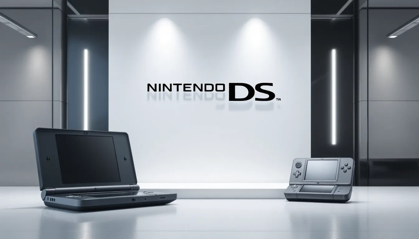
When Nintendo launched the 3DS in 2011, they faced a familiar challenge: communicate new technology (stereoscopic 3D) while signaling continuity with the DS family. The solution? Keep the core typography and add a “3” in a contrasting color.
The 3DS logo used the same sans-serif family as DS, maintaining visual continuity. The “3” appeared in blue or red (depending on region and context), sometimes with a subtle gradient suggesting depth, a nod to the 3D gimmick. This approach told consumers “this is the next DS” without requiring explanation.
Nintendo repeated this strategy with the New 3DS and 2DS variants, always anchoring changes to the established DS logo foundation. It’s brand evolution done right: new enough to signal progress, familiar enough to retain existing audiences. Gaming news outlets like IGN frequently analyzed these branding shifts and their impact on consumer perception.
Comparing DS and Switch Era Design Language
The Switch, launched in 2017, marked a departure from the DS/3DS branding lineage. The Switch logo uses a bolder, more geometric sans-serif with thicker strokes and tighter spacing. The color palette shifted to red and white, aligning with Nintendo’s classic corporate colors.
Yet echoes of the DS design philosophy remain: simplicity, high contrast, geometric precision, and avoidance of trendy effects. Both logos prioritize legibility across contexts (physical hardware, digital storefronts, packaging). The Switch logo feels more aggressive and modern, fitting a console that bridges handheld and home gaming, but it shares the DS’s commitment to timeless design over flash.
Nintendo learned from the DS that a strong logo can carry a product family through multiple hardware iterations. The Switch Lite and Switch OLED use the same core logo with minimal tweaks, a strategy proven during the DS era. This consistency builds brand recognition and reduces marketing complexity across global markets.
The DS logo’s legacy is about more than aesthetics. It demonstrated that Nintendo could create sophisticated, modern branding without abandoning the approachability that defines the company. That balance continues to shape their design language today.
The Logo’s Impact on Gaming Culture and Collectibility
Logos transcend their commercial origins when they become cultural touchstones. The Nintendo DS logo achieved this, embedding itself in gaming nostalgia and collector communities in ways Nintendo likely didn’t predict.
Nostalgia Factor in Modern Gaming Communities
For millennials and Gen Z gamers, the DS logo triggers instant nostalgia. It represents a specific era: mid-to-late 2000s handheld gaming, before smartphones dominated portable entertainment. Seeing that logo conjures memories of playing Pokémon Diamond during lunch breaks or grinding Professor Layton puzzles on long car rides.
Online communities on Reddit, Discord, and gaming forums celebrate DS-era games with a reverence usually reserved for SNES or N64 classics. The logo itself has become shorthand for this nostalgia. Streamers and YouTubers use the DS logo in thumbnails and overlays when covering retro content, knowing it’ll resonate with audiences who grew up with the hardware.
This emotional connection has real market impact. DS systems and games have seen price increases on the secondhand market, with sealed or limited edition units commanding collector premiums. The logo’s presence, intact, unfaded, affects collectible value. A DS Lite with a pristine logo is worth more than one with wear on the branding.
DS Logo in Fan Art, Merchandise, and Media
The DS logo appears frequently in fan art and unofficial merchandise, often paired with specific game imagery or reimagined in different styles. Artists create retro-themed posters featuring the logo alongside classic DS titles. Etsy and Redbubble are flooded with DS-themed designs that incorporate or reference the original branding.
Nintendo’s official merchandise occasionally brings back DS branding for anniversary or retro collections, though these are relatively rare compared to NES or SNES throwbacks. When they do appear, they sell quickly, proof of the logo’s enduring appeal.
In gaming media and documentaries, the DS logo serves as visual shorthand for handheld gaming’s golden era. Whenever content creators discuss Nintendo’s handheld history, that logo pops up as a key milestone. Publications like GameSpot have featured retrospectives highlighting the DS’s design and branding alongside its game library and impact on the industry.
The logo also lives on in UI and design inspiration. Indie developers creating retro-styled games sometimes reference DS aesthetics, including UI elements that echo the logo’s clean, geometric style. It’s influence without imitation, the DS design language informing new creative work.
Using the Nintendo DS Logo: Official Guidelines and Resources
For content creators, journalists, and designers who need to use the Nintendo DS logo legitimately, understanding official guidelines and available resources is essential. Nintendo protects its trademarks rigorously, but provides pathways for appropriate use.
Official trademark guidelines from Nintendo specify that logos cannot be altered, recolored (outside approved variations), or used in ways that imply endorsement. Fan projects, YouTube thumbnails, and editorial content generally fall under fair use, but commercial products require licensing.
Nintendo’s media and press resources occasionally provide high-resolution logo files for journalists and reviewers. These are typically distributed under embargo for new releases or made available through Nintendo’s press site for approved media. Access requires media credentials and adherence to usage terms.
For commercial licensing, businesses must contact Nintendo’s legal department directly. This applies to merchandise, app development, or any product where the DS logo would appear as part of branding. Licensing fees and approval processes vary by use case and region.
Educational and archival use generally receives more leeway. Academic papers, design case studies, and historical retrospectives can include the logo under fair use provisions, provided it’s for analysis or commentary rather than decoration or branding.
Designers studying the logo can extract valuable lessons: prioritize readability, design for multiple contexts simultaneously, avoid trendy effects, and build in flexibility for color and size variations. The DS logo is a functional design success, not just an aesthetic one.
For those creating DS-related content (guides, reviews, retrospectives), using official imagery and logos appropriately adds credibility. Always source high-quality versions rather than upscaling low-res images, and credit Nintendo when appropriate. It’s about respecting the brand while creating valuable content for gaming communities.
Conclusion
The Nintendo DS logo represents more than corporate branding, it’s a visual artifact of a transformative era in handheld gaming. From its debut in 2004 through the final DSi XL units rolling off production lines, that simple wordmark communicated innovation, quality, and Nintendo’s commitment to doing things differently.
What makes the logo remarkable isn’t complexity, but restraint. Nintendo resisted the urge to over-design, trusting that clean geometry and smart typography would outlast flashier alternatives. Two decades later, the DS logo still looks modern while competitors’ branding from the same era feels dated.
For designers, it’s a lesson in timelessness. For collectors, it’s a symbol of nostalgia and a specific moment in gaming history. For Nintendo, it proved that strong branding could carry a product family through multiple hardware iterations and global markets without losing coherence.
The DS may no longer be in production, but its logo lives on, in fan communities, retro collections, and the design DNA of Nintendo’s current branding. That’s the mark of iconic design: it transcends its original purpose and becomes part of cultural memory.

